From Favorites to Proof: How Smarter Message Testing Wins Campaigns

We’ve all been there. The client has a favorite. The copywriter has a favorite. The board has a favorite. And you? You’ve got your hunch.
The trouble is—they’re all different. And the campaign you’re about to launch has real money behind it. This isn’t the moment for gut feel. It’s the moment for proof.
At Evolve, we see this all the time. Agencies pour their creative energy into generating a dozen (or more) message options, only to find themselves stuck in a standoff: everyone has an opinion, and no one can agree. That’s where smart research comes in—not to replace creativity, but to show you the true winner—and the right mix that will make your campaign resonate across audiences.
Why “Pick Your Favorite” Fails
Traditional message testing often relies on a simple poll: show people the list, ask which one they like best, and tally the results. The problem? With 15 messages on the table, respondents skim, guess, or default to the first one that catches their eye.
In one recent case, we asked 800 people to pick their favorite from a list of 15 messages. The result? Nothing stood out. No clear winner. Just noise.
And testing that many messages isn’t easy—15 is a lot for any team to juggle, and more than most traditional methods can handle. But MaxDiff made it possible, cutting through the clutter to reveal which ones truly rose above.
And if nothing stands out, what exactly are you going to recommend to your client?
MaxDiff: Cutting Through the Noise
This is why we layered in MaxDiff—a forced-choice method that flips the script.
Instead of ranking or rating everything at once, respondents see just a few messages at a time and make a sharper decision: which one is most motivating, and which one is least.
It’s simple for the respondent, but incredibly powerful for the agency.
Here’s how it looks in practice:
Which of these messages would most motivate you to visit Oklahoma City? Which would least?
- “A city where careers thrive and families grow.”
- “Oklahoma City: affordable, accessible, and full of opportunity.”
- “From concerts to craft beer, OKC delivers on culture.”
One click for “most.” One click for “least.” Done. Then the respondent sees another set of three, drawn from the larger pool of 15.
To the participant, it feels quick and random. But behind the scenes, it’s anything but random. Statistical design ensures every message gets a fair shot—appearing in balanced positions, paired against different competitors, over dozens of rounds. This eliminates order bias and guarantees that we’re comparing apples to apples.
From those hundreds of micro-choices, we calculate Preference Share—a number that shows how often each message rose to the top.
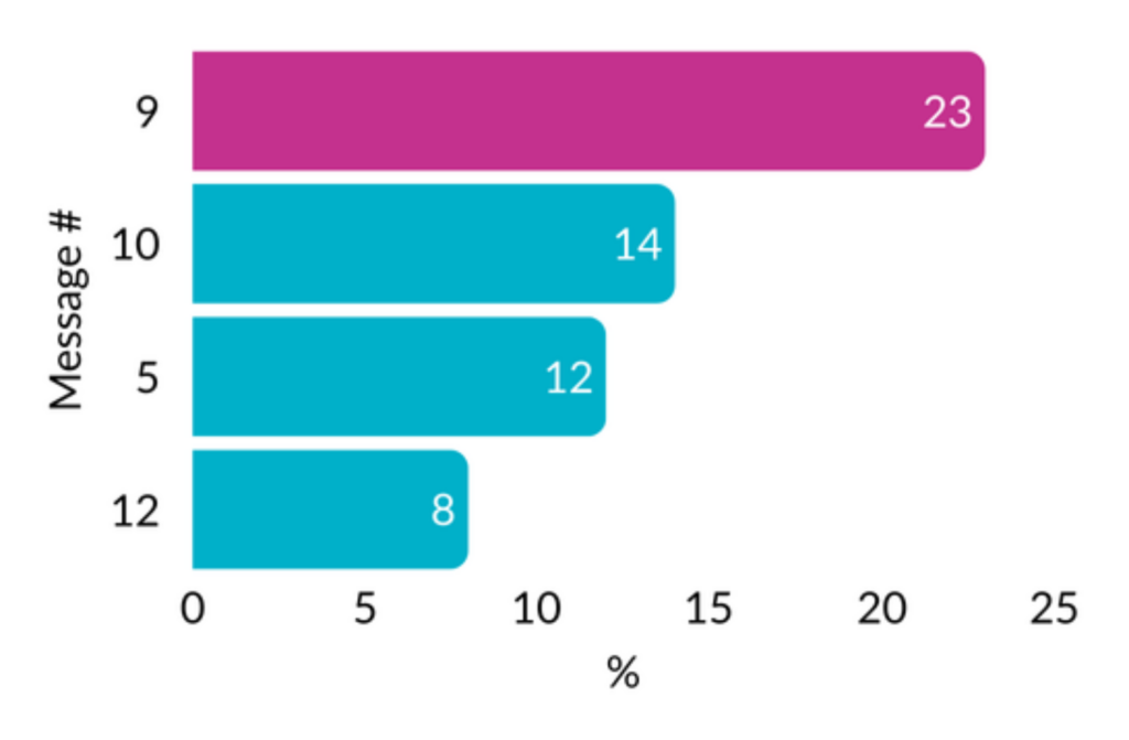
The Difference Between “Liked” and “Proven”
On paper, “23%” might not sound game-changing. If you saw that number in a simple poll, you’d probably shrug—less than a quarter of people picked it, so what’s the big deal?
But in MaxDiff, that number means something entirely different. It means the message didn’t just get noticed once or twice—it consistently outperformed every other contender across dozens of head-to-head matchups. It kept rising to the top no matter what it was paired against.
Think of it like the playoffs. Every message gets its shot, and only the ones that can keep winning move forward. A 23% Preference Share isn’t just a slice of votes—it’s the championship record. It tells you this message didn’t squeak by on luck or preference bias—it survived the stress test and proved it can hold its own against any rival.
For agencies, that’s gold. Instead of walking into a client meeting with a chart that feels like opinion dressed up as data, you bring proof of a champion. The conversation shifts from “we think this works” to “this message won under pressure, and here’s the evidence.”
That’s not just research—it’s a strategy advantage.
Beyond a Clear Winner: TURF and Cluster Analysis
Of course, real-world campaigns rarely run on a single message. Winning strategies are built on combinations and connections—and that’s where we go further.
TURF Analysis: Finding the Smartest Mix
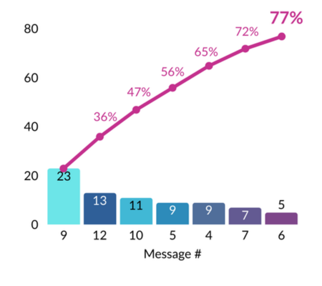
TURF (Total Unduplicated Reach and Frequency) answers a critical question: Which mix of messages gives us the broadest reach without wasting effort on overlap?
Imagine you have six strong contenders. TURF shows you that by running them together, you’ll reach 77% of the audience—far more than if you just picked one. For agencies, that means you’re not betting the farm on a single line. You’re building a message portfolio that maximizes impact across the market.
Cluster Analysis: Knowing Who Responds to What
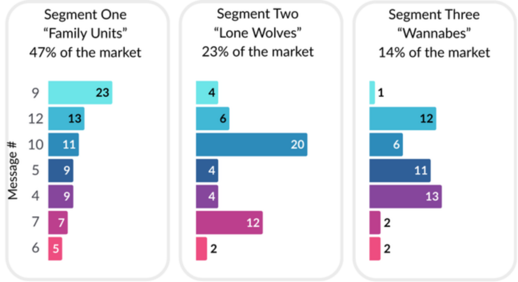
Not every audience reacts the same way. Cluster analysis reveals the natural segments hidden in your data—the “families” of people who respond similarly to certain ideas.
One cluster may be persuaded by hard numbers (jobs, dollars, tax impact). Another may light up at emotional storytelling (community, family, pride). By identifying these groups and what resonates with them, you give your creative team a roadmap: not just what to say, but to who
Why Agencies Should Care
Your client doesn’t want data for data’s sake. They want clarity, confidence, and proof they can take to their boss, their board, or their investors.
Smart message testing gives you:
- A clear winner when the team is divided.
- The best mix when coverage matters more than consensus.
- Audience maps that show exactly who’s persuaded by what.
This isn’t academic—it’s strategy fuel. It’s how you move from “everyone has an opinion” to “we have proof.”
The Bottom Line
Message testing done right doesn’t just crown a winner. It gives you a playbook: which messages win, which mixes matter, and which audiences you need to reach.
That’s what turns creative energy into campaign impact. And that’s what makes agencies look not just smart—but indispensable.
Curious what this could look like for your next campaign?
Download our message testing one-pager. ⬇️
Case study: 15 Messages to One Clear Winner
Posted by
-
 Brinkley AcordDIRECTOR OF ANALYTICS